Lord Calvert® Canadian Whisky Gets an Updated Look in 2021
Lord Calvert® Canadian Whisky is introducing new packaging, along with rebranding the website and social media channels. The subtle changes provide the brand with an updated look, but one that is certain to be easily recognizable to Lord Calvert Canadian Whisky fans.
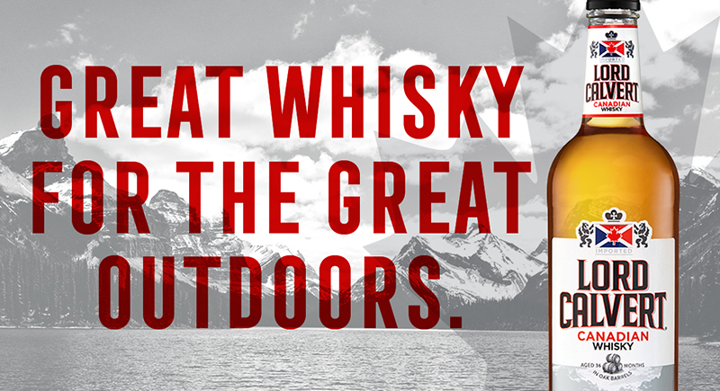
Enhancements include bolder lettering for the Lord Calvert name, and the “Canadian Whisky” callout below no longer features a scripted font.
The updated label also features two new design elements. First is the addition of an image of three barrels and the words: “AGED 36 MONTHS IN OAK BARRELS,” reflecting the maturation process of the blended whiskies. Second is the incorporation of an image of the Canadian Rockies to drive home the fact that this is a Canadian Whisky – something that had not been featured before on Lord Calvert labeling.
“When it came time to redesign the Lord Calvert packaging, we didn’t want to stray too far from the existing label design, but rather to bring it into a modern light,” said Joyce Freiberger, Trade Marketing Manager at Luxco®. “Adding the image of the Canadian Rockies is something completely new for this brand, and we felt it was an appropriate salute to this brand’s Canadian heritage.”
Lord Calvert’s redesigned website, social media channels and sell-in materials utilize the Canadian Rockies imagery accompanied by the brand’s new tagline, “Great Whisky for the Great Outdoors.”
Bottles of Lord Calvert Canadian Whisky featuring the new label will begin to hit shelves throughout 2021 as old labels are depleted and existing stock is sold at retail. The new look will be featured on all sizes of Lord Calvert, including 50mL, 200mL, 375mL, 750mL, 750mL Traveler, 1L and 1.75L bottles.